Typography - Task 1

21.4.2025 - 20.5.2025 (week 1- 5)

FANN WONG JING EN|0382237

Design Principles | Bachelor of Design (Honours) in Creative Media 

Typography GCD60104


TABLE OF CONTENT 

MIB      Lecture Note      Task 1      Feedback     Reflection     The further reading

MODULE INFORMATION BRIEF (MIB)


LECTURE NOTE

Week 1: Development

0. Introduction to Typography
• Typography is a core part of design learning. It not only improves the sensitivity to details and composition, but is also a key skill applied in all visual designs such as graphic design, websites, apps, animations, logos, and brands.

• It combines the evolution of calligraphy, lettering, and digital font design, and contains a large number of professional terms, conventional rules, and style variations.

Common Terms
• Calligraphy: The art of handwritten calligraphy.
• Lettering: The way of drawing letters one by one.
• Font: A specific style in a font (such as Georgia Italic).
• Typeface: A group of font families with a common style (such as Georgia, Arial).

 1. History of Letter Development

From Phoenicia to Rome
• The earliest writing was carved on stone or clay with sharp tools, which determined the structural characteristics of the letters.
• Greek introduces “Boustrophedon” – alternating right-to-left and left-to-right writing, with alternating letter directions.
• Etruscans first drew with brushes and then carved into marble, which influenced the thickness of the strokes later.
fig1.1 From Phoenician to Greek to Roman letters | from lecture Typo_1_Development


3rd–10th century: Evolution of handwriting
• Square Capitals: Common capitals in Roman inscriptions, with the pen tilted at about 60°, forming clear serifs.
• Rustic Capitals: Compressed version of Square Capitals, which saves space but is more difficult to read, with the pen tilted at about 30°.
• Roman Cursive: A rapidly written lowercase prototype used in daily transactions.
• Uncials & Half-Uncials: A script with lowercase features that laid the foundation for later lowercase.
• Caroline Minuscule: Charlemagne promoted the standardization of writing in 789 AD, developing uniform standards for uppercase, lowercase, and punctuation.

Late Middle Ages to Printing
• Blackletter: A dense, vertical font used in Northern Europe.
• Rotunda: A rounded, open writing style from Southern Europe.
• Gutenberg movable type: Each letter was cast in a separate metal mold to enable mass typesetting.

Font style evolution timeline

1450 Blackletter—dense, imitating handwriting
1475 Oldstyle—a blend of Roman epigraphic and humanistic styles
1500 Italic—slanted, compact
1550 Script—imitation of calligraphy, used for short texts
1750 Transitional—high contrast strokes
1775 Modern—extremely contrasting, uncurved serifs
1825 Slab Serif—heavy serifs, suitable for advertising
1900 Sans Serif—modern, geometric, sans serifs
1990 Serif / Sans Serif—hybrid style (semi-serifs)


Week 2: Basics of text spacing and formatting  

1.Terminology related to word spacing
• Kerning
   Automatically adjust the spacing between two letters.
• Letters-pacing
   Manually add space between each letter.
• Tracking
   Adjust the spacing of the entire word or sentence, which can be divided into:
   ·Normal
   ·Loose
   ·Tight

Capital letters can be moderately spaced to enhance visuality, and large-scale letterspacing is not recommended for lowercase letters due to reading fluency.
 

fig1.2 Text / Tracking: Kerning and Letter-spacing  | from lecture Typo_3_Text Part 1


 2. Text formatting methods
 Flush Left: Closest to the natural state of handwriting, unified starting point, and uneven on the right.
• Centered: Creates symmetry and formality, often used in poetry and ceremonial copywriting.
• Flush Right: Emphasizes the end of a paragraph, suitable for scenes such as picture descriptions.
• Justified: Aligning the left and right borders may easily lead to “blank rivers”, so line breaks and ligatures should be handled with caution.
 
fig1. 3 Anatomy of a Typeface | from lecture Typo_3_Text Part 1
 3. Font size and reading experience
• Font size: Should be legible within arm’s length.
• Leading: Too small a spacing will interfere with reading; too large a spacing will easily lead to “striping”.
• Line Length: It is recommended to keep the length within 55–65 characters to improve reading rhythm.
• Ideal text block: Has a uniform “grayscale value”, that is, a visually balanced gray density on the page.
 

Week 3: Advanced paragraph structure and typography

1. Paragraphs and spacing
• Pilcrow (¶): Paragraph identifier, originated from medieval manuscripts.
• Paragraph indentation: Often equal to font size or line spacing, suitable for justified format to avoid unevenness at both ends.
• Leading vs Line Spacing
   Leading: The distance from baseline to baseline;
   Line Spacing: Consider the space between the ascenders and descenders of upper and lower letters.
fig1.4 line space vs leading | from lecture Typo_4_Text_Part 2
 
2. Avoid typographical errors
• Widow: A separate line of text at the end of a paragraph.
• Orphan: A separate line at the top of a new page at the beginning of a paragraph.
 
3. Text emphasis
• Italic / Bold
• Color change (limited to printing colors)
• Change font
• Hanging alignment / Quotation mark highlighting
 
 4. Titles and hierarchy (Heads)
 A Head: A large title, usually bold and capitalized, indicating the beginning of a chapter.
• B Head: A subtitle, indicating a new topic or argument; often small caps, italics and other styles are used.
• C Head: A sub-topic, embedded in a paragraph, with a simple form.

A reasonable title structure builds a clear reading hierarchy and rhythm.
 
5. Cross-Alignment (Alignment consistency)
Strengthen the grid system and visual rhythm of the page, suitable for multi-column or complex layout pages.


Week 4: Basic
01|Where does the font stand? ——The concept of lines
• Baseline
Like the sole of a shoe, it is the horizontal line on which all letters stand.
• Median
The top of lowercase letters like "x" or "e" is mostly not higher than this line.
• X-height
The height of "x" is the key indicator to judge the proportion of font thickness.

fig1.5 Basic / Describing letterforms | from lecture typo_2_basic

02|How is the font drawn? ——Terminology of lines and strokes
• Stroke
The basic construction line of the font, each stroke is the skeleton of the structure.
• Apex / Vertex
The angle formed by two oblique lines converging: the upward one is called Apex (such as "A"); the downward one is called Vertex (such as "V").
• Arm
The protruding horizontal or oblique line, like the outstretched hands of "E" and "F".
• Leg
The line extending downward or outward, such as the stroke of "K" and the stroke of "R". • Cross Stroke
The horizontal line that connects two main branches, such as the one in the middle of "H".
• Crotch
The space between two strokes, such as the corner in the middle of "V" and "Y".

03|"Body Movement" of Fonts - Extension, Curl and Decoration
• Ascender
The part of a lowercase letter that extends upward (such as "b" and "l").
• Descender
The part that extends downward (such as "g" and "p").
• Bowl
The closed circular area in a letter, such as the belly of "b", "d" and "o".
• Loop
Specifically refers to the small circle below the lowercase "g".
• Link
The small arc that connects the belly of "g" and the small circle.
• Shoulder
A soft curve that is not a circle but very gentle, such as the arch of "h" or "n". • Spine
The elegant curve of the "S" is its core.
• Finial
A small tail without serifs, often seen at the end of the lowercase "a", like a drop of water.

04|"Faces and ornaments" of fonts - ending, connection and decorative elements
• Terminal
The end of the letter stroke, where there is no serif, clean and neat.
• Serif
The small decoration at the end of the stroke, like the corner of the steps of a classical building.
• Bracket
The transition line between the serif and the main body, with an elegant sense of connection.
• Barb / Beak
The tail of the semi-serif: Barb appears at the end of the curved stroke (such as "C"); Beak is like a bird's beak and appears at the end of the horizontal line (such as "T").
• Swash
Decorative extended lines, sometimes gorgeously curled, common in romantic or classic fonts.

05|Special Role: Letter Co-branding and Spatial Concept
Ligature
The combination of two letters, such as "fi", not only saves space, but also improves reading fluency.
Counter
The "hole" surrounded by the inside of the letter, like the white area in "o" and "e", is the breathing space of the font.

06|Units and Punctuation: Small Details in Typesetting
Em (Full Square)
A commonly used unit in typesetting, with a width equal to a capital "M", and also determines the width of the long dash (-).
• En (Half Square)
Half the width of Em, representing the short dash (-), such as "1996-1999".

07|"Family Tree" of Fonts-Classification of Fonts
Fonts not only have appearances, but also "personalities". Common classifications include:
Serif
It has feet and decorations, suitable for formal and printed occasions.
Sans Serif
Clean and modern, it is the most common choice for web pages and apps.
Slab Serif
The serifs are thick and powerful, full of visual impact.
Script
As smooth and elegant as handwriting, suitable for emotional content.
Blackletter
The style of medieval manuscripts, heavy and classical.
Display
Used for titles and signs, it is used to attract attention without emphasizing reading efficiency.
Monospace
Each letter occupies the same space, often used in codes or tables.

TASK 1 | PART 1


Type Expression
Software: Adobe Illustrator, Adobe Photoshop
• You will be given 4 words to express creatively in fonts.
• Start with hand-drawn sketches to conceive the design direction.
• In the digital stage, you need to use the following 10 designated fonts:
• Adobe Caslon Pro, Bembo, Bodoni, Futura, Gill Sans, ITC Garamond, ITC New Baskerville, Janson Text LT, Serifa, Univers LT

Visual References
JUMP
fig1.6 jump visual references 

• Action meaning: The body quickly leaves the ground, leaps up or forward, sometimes with a sense of rhythm (such as dance, sports).
• Visual impression: light, flying, jumping, with explosive power or momentary tension.
• Emotional symbolism: It symbolizes vitality, freedom, breaking free, and the eruption of vitality.

MELT
 
fig1.7 melt visual references 

• Physical meaning: solids turn into liquids when heated, such as ice turning into water.
• Psychological symbolism: defenses or indifference slowly soften, emotions gradually reveal themselves, such as "the heart is melted by tenderness".
• Visual impression: soft, gradual, transition from hard to warm, with a sense of temperature.

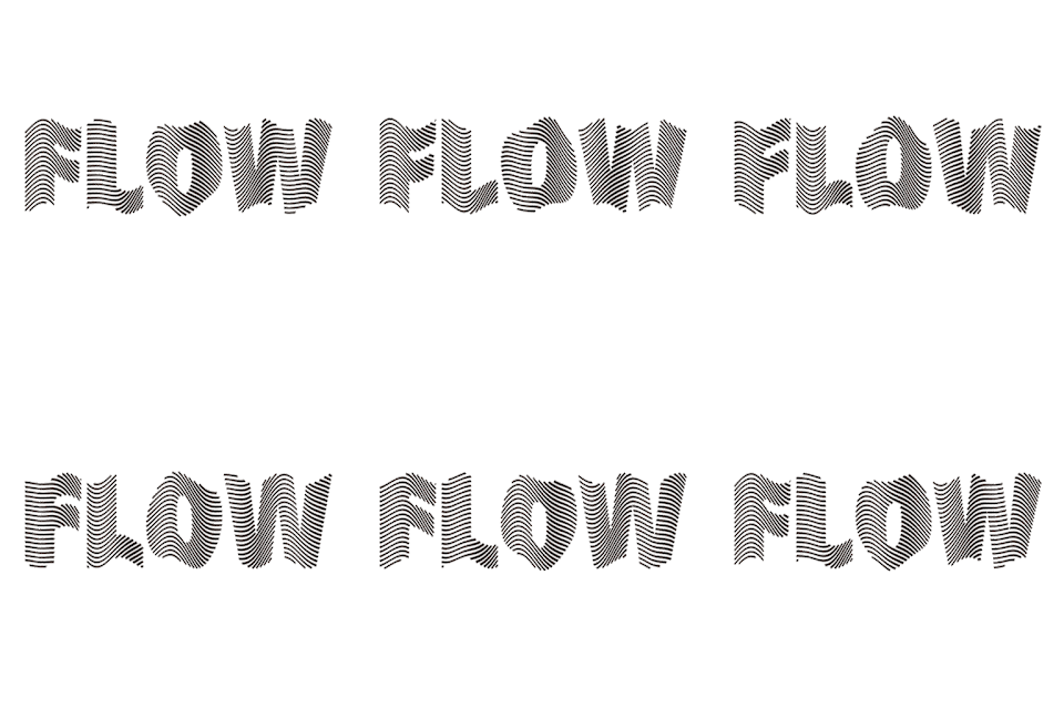
FLOW
 
fig1.8 flow visual references 

• Dynamic description: liquid or gas continues to move, without stopping, with direction but no fixed shape.
• Emotional symbolism: smoothness, naturalness, release, continuation of vitality, or change and uncertainty.
• Visual impression: such as the flow of water, the fluttering of hair, and the swaying of clothes in the wind.

SHAKE
 
fig1.9 shake visual references 

• Physical description: The slight swaying of an object from side to side or back and forth usually indicates instability.
• Psychological symbolism: Indecision, wavering, or movement in a rhythm, such as drunkenness, shadows of trees in the wind.
• Visual impression: cradles, branches, boats, the swaying of lights.
• Associative imagery: lights swaying in the breeze at night, unsteady steps while walking, wavering emotions.


SKETCHES

fig2.0 S
ketches 1

        After the first time MS Vitiya gave me feedback and I actually used Adobe Illustrator, I felt that the previous sketches could not meet the requirements and could not be presented well in AI, so I made a different sketch before the other three words were finalized.
fig 2.1 Sketches 2

Digitization

fig2.2 digitization 1

fig2.3 digitization 2


ANIMATION ARTWORK

fig2.4 Animation artwork 


TASK 1 | PART 2


TEXT FORMATTING 
fig2.5 Kerning & Tracking 1/4
LAYOUT EXPLORATION 
fig2.6 layout exploration 

FINAL OUTCOME 

fig2.7 final outcome

Head Line :
Typeface: Bembo STD
Font/s: Bembo STD Bold
Type Size/s: 53/30 pt
Leading: 48/29 pt
Paragraph spacing: 0

Body :
Typeface: Bembo STD
Font/s: Bembo STD Regular
Type Size/s: 11 pt
Leading: 12 pt
Paragraph spacing: 11 pt
Characters per-line: 57
Alignment: Left justified 
Margins: 123mm top, 26mm left + right + bottom 
Columns: 2
Gutter: 10 mm


FEEDBACK


Week1
General feedback:  Mainly explain the principles of the course and talk about the course plan for the next few weeks. 1. Create a e-portfolio 2. Download 10 fonts to publish to teams 3. Select six characters and need to draw sketches for typography 4. Need to watch the published YouTube video in advance. 

Week 2
General feedbackSketches also need to have a clear idea of ​​the viewer, so the grid is very important. 
Specific feedback: None

Week 3
General Feedback: You can use the 5W1H questions to design and think when creating.  
Specific feedback: The word "melt" can be improved a little bit to achieve reasonable creation, but it is good. "Jump" is good and you can see the dynamic effect, but there is no specific saying which one is good. "Flow" and "Stretch" do not see good results. "Grow" The last sketch can change the fonts sequentially, so that it looks like "worg". "Shake" The third sketch can try to make an animation effect.

Week4
General feedback: The animation will be completed and uploaded to the ePortfolio today.
Specific feedback: The designs of the four fonts are good, especially the word "flow", which can be animated. 

Week5
General feedback:
Specific feedback:  The overall image is unbalanced, and one side of the image seems heavier. You can try resizing the image or using a different layout to make the image more balanced. 

REFLECTION


• Experience

- Fonts

In this exercise, I deeply realized for the first time that fonts are not just tools for conveying information, but a visual language that can express emotions, rhythm and movements.

In the expression task, I tried to design the font expressions of the four words "Melt, Flow, Shake, Stretch" as the core. Among them, the dynamic challenge of "Flow" is the greatest. I decided to make it into an animation and use Adobe After Effects for dynamic presentation. This process not only made me re-understand the meaning of "flow", but also made me understand that once the text moves, it becomes a stronger emotional medium.

Through the timeline control, easing, and transition processing in the animation, I practiced how to make the font movements more natural, coherent, and rhythmic. Even a difference of only a few frames will affect the overall feeling. This high sensitivity to "details" is something I never had before.

- Typesetting Practice

In the second task, we need to arrange the text into a complete poster, using typesetting principles such as Kerning (word spacing adjustment), Leading (line spacing adjustment), and Ragging (natural line break processing). This is a process of switching from "free expression" to "design order".

I found that even without images, the reasonable arrangement of word spacing, line length, and alignment can create a clear and guiding layout. In particular, the control of Ragging - avoiding abrupt border shapes on the right side of the paragraph - is a small detail that I have not noticed before, but it greatly affects the reading experience and the integrity of the page.

•  Observation

Throughout the process, I kept thinking about a question: How to strike a balance between expressing emotions and maintaining readability?

If the font design is too fancy, the audience may not understand it; if it is too conventional, it loses its visual appeal. I gradually learned to "pull" between the two, so that the font has both personality and does not "talk to itself".

Animation design made me observe that the sense of time is part of the composition, and rhythm, speed and even pauses can become "visual grammar"; while layout design made me understand that good typography is the result of looking without any design traces, but very comfortable to read.

•  The final discovery

Through this project, my biggest discovery is that Typography is not just about choosing fonts, but about constructing a visual language system.

I began to learn how to make text convey a "sense of temperature" and how to use format to guide readers' sight. I also began to understand that the proficiency of design software and the integration of design theory are two indispensable wings.

In particular, the study of After Effects made me realize that "concepts that cannot be expressed by static design can be realized through dynamics." In text typography, consistency and alignment principles are the skeleton of the layout - the rhythm of the font is hidden in those rows of orderly lines and gaps.


THE FURTHER READING


fig2.8 typography referenced

         
When I first read the book "Typography, Referenced", I thought it would be a typical "font tool book" that provides font history, style classification and practical guides. But after reading it in depth, I found that the uniqueness of this book is that it does not simply introduce fonts, but deeply weaves "fonts" as a civilization construction process of visual language from multiple dimensions of history, design, technology and application. It is more like an "encyclopedia of fonts" with a solid structure and detailed information. It is a treasure for design learners, typesetting researchers, and even anyone who pays attention to visual communication.


1. Words are the precipitation of civilization

What impressed me most about this book is its combing of font history. From ancient Greek stone letters and Roman capitals to medieval Gothic letters, to the birth of fonts such as Garamond, Baskerville, and Bodoni, the font styles of different historical periods are not only the product of technology, but also the symbol of the aesthetics, culture and ideology of that era. The book mentions that classical fonts are not just "designs", they are important tools for printing revolution and ideological liberation. The birth of a set of fonts is often a witness to a cultural awakening.

2. Fonts are not decorations, but carriers of meaning

This book made me deeply understand that typesetting is not as simple as choosing and arranging words, but a design process of "how content is understood". The information intensity, hierarchical relationship and readability of a text largely depend on the choice of fonts, character spacing, line spacing and visual rhythm. Especially in the "Typographic Principles" chapter, the book deeply analyzes the composition principles such as hierarchy, contrast, whitespace, rhythm, etc., which made me realize that designers are actually guiding readers "how to read" rather than just "looking beautiful".

3. From technology to emotion: the revival of modern font design

This book also puts forward important views on the future development of font design. In the digital age, font design has entered a "decentralized" prosperous stage: open platforms, independent font foundries, web fonts, dynamic variants, etc. continue to emerge. In particular, the "Type Design and Development" chapter emphasizes that font design is not only a tool rationality, but also an extension of the creator's emotions and cultural identity. I particularly like a sentence in the book:

"Typography is no longer the invisible servant of design, but rather recognized as design of the highest order."

This sentence made me reflect that in our era dominated by "good looks", real visual design should not only be superficial appeal, but also return to "language and meaning" itself. Fonts are actually a silent expression, an extension of inner style.

Comments

Popular posts from this blog

TASK1 :EXPLORATION

TYPOGRAPHY- TASK 2